 David Emery Online
There is a fold
13 June 2009
Back in 2007, at the lovely @media conference (which I’ll be attending this year again in a couple of weeks) as part of the High-Noon Shoot-Out session, Drew McLellan argued passionately that ‘There Is No Fold’. He had placards and everything:
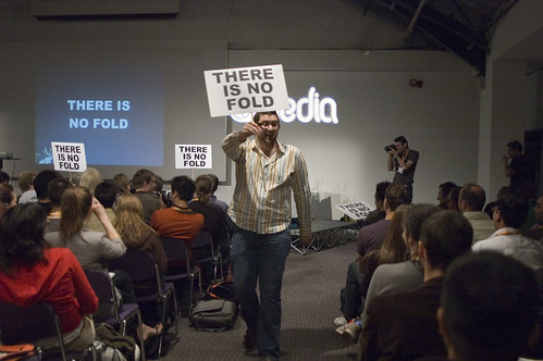 Photo by Jason Santa Maria
The ‘fold’, for those of you that don’t know, is a term used in the newspaper industry referring to the fold of a folded newspaper – anything above half-way up the page is ‘above the fold’ and is of more importance as it’ll be seen when the paper is folded on a news stand. This term has successfully made the journey into the web-world (unlike many of the newspapers…), and now refers to the content you can see on a web page without scrolling.
Of course – and what Drew is referring to with the placards – is that on the web, the concept of ‘the fold’ doesn’t really make much sense; there is no ‘one’ window size – everyone uses different size screens, and you might not have your window maximised, so the idea of there being a hard line across your immaculate page design where everything above it is visible on page load and everything below it needs scrolling to get to is rubbish.
Sort of.
The problem with the whole ‘there is no fold’ thing is that, well, there is a fold. Sure, it varies system to system depending on your browser window size but that doesn’t mean it’s not there. It just makes it a little tricky.
There’s no way using pure CSS that we can figure out where the ‘fold’ is, but with the application of a little Javascript we can dynamically re-size elements on the page to put on the page exactly what we want people to see when they first load the page. It’s exactly what this site does – on load (and on resize) it figures out how big the window is and sets the height of the top bit to the same size, so all you get is the main background image plus the title graphic (which is positioned relative to the bottom of the window as well).
If you want to delve into the JS and see how it works for yourself it might be easier to have a look at the Discovery Site, specifically the scale.js file where all the work is done. This site is actually fold-less (yes, I’m now making up jargon) as it uses the same techniques to make sure that everything is centred on the screen at all times, no matter what size the window is.
With a little bit of progressive enhancement we can use Javascript to make sites that present the information you want people to see when they first get to your site. The fold exists, but it’s pretty easy to tame it and make it do what you want.